The official one-stop influencer marketing platform, connecting brands and creators on TikTok from ideation to payment and analysis. I led the client-creator collaboration workflow revamp.
Concept Development
Product Strategy
UX Design
Interaction Design
Visual Design
Figma
July 2021 - September 2021
TikTok Creator Marketplace is the official one-stop influencer marketing platform which connects brands and creators on TikTok, allowing TikTok creators to monetize their content creation. It provides services throughout the entire cycle of influencer marketing, ranging from ideation, discovery, outreach, negotiation, production to payment and analysis.
・・・・・・・・・・・・
I led the client-creator collaboration workflow revamp, which covers most of the user flow of TikTok Creator Marketplace. It is a 0 to 1 initiative, where I provided end to end delivery, from kicking off the revamp by sharing design problems of the existing flow, creating a low-fidelity design to communicate initial ideas, conducting workshops to align and consolidate with stakeholders on scope, objectives and use cases for each client persona, creating flowcharts and mid-fidelity designs, to prototyping, user testing, and finally to a high-fidelity mockup and working prototype for demo.

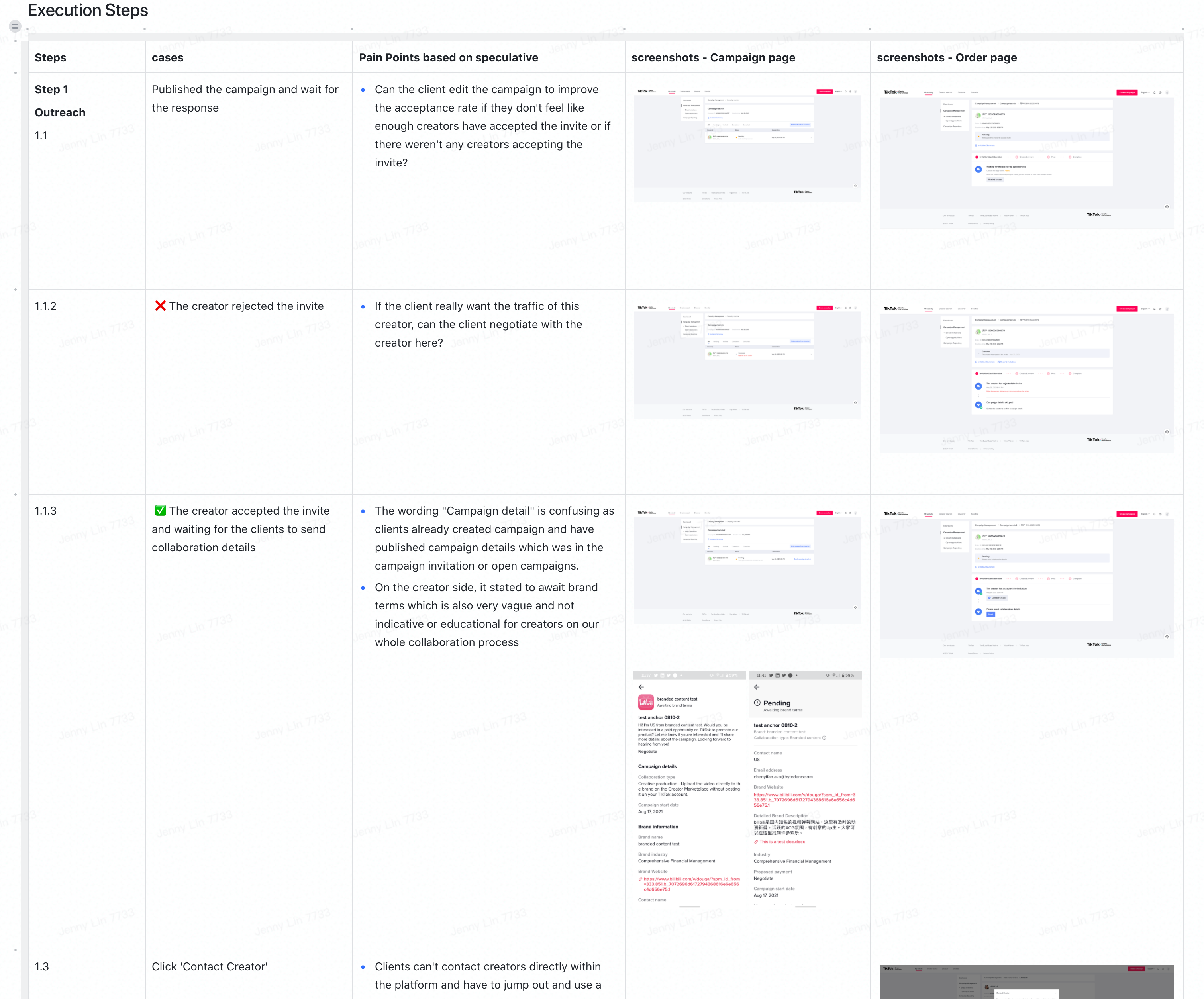
TikTok Creator Marketplace client-creator collaboration workflow is the steps that clients take to execute and complete collaborations with their chosen creators, for branded content use cases. From a product standpoint, this includes all of the existing campaign building, invitation, and collaboration steps that clients can take on the platform.
Our mission is to enable creators to monetize their content through partnering with businesses and brands who want to achieve their marketing objectives. In order to achieve this mission, we need to solve the brands' pain points and provide tools to brands and agencies that make collaboration with creators easy and efficient.
We believe our clients' collaboration workflow experience can be significantly improved if we make it more flexible, personalized, and modular. This way, clients can come to TikTok Creator Marketplace and easily "choose their own journey" to get their job done most efficiently.
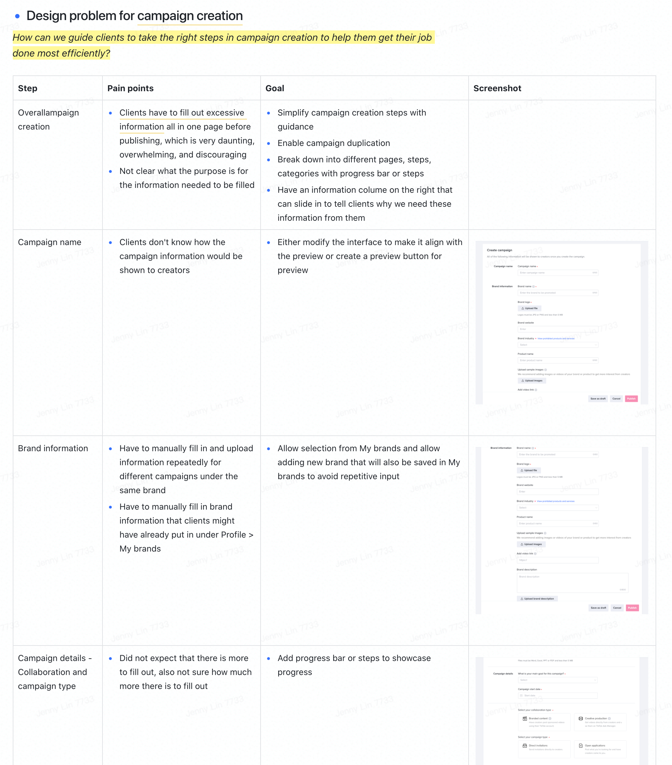
I kicked off the project by aligning everyone on the product team of our scope, goal, and use cases for each client persona for this initiative, and walked them through the design problems of our existing collaboration workflow with possible solutions to jump start the conversation.
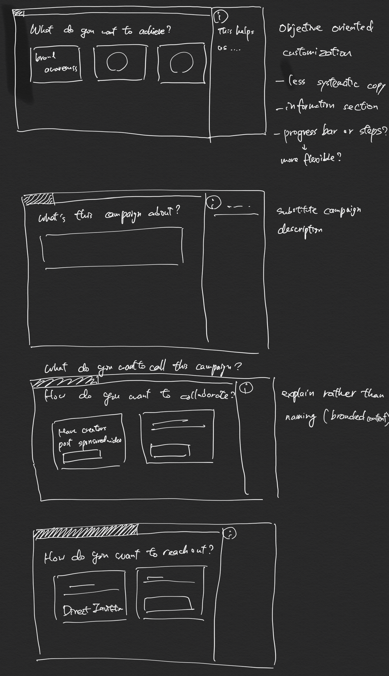
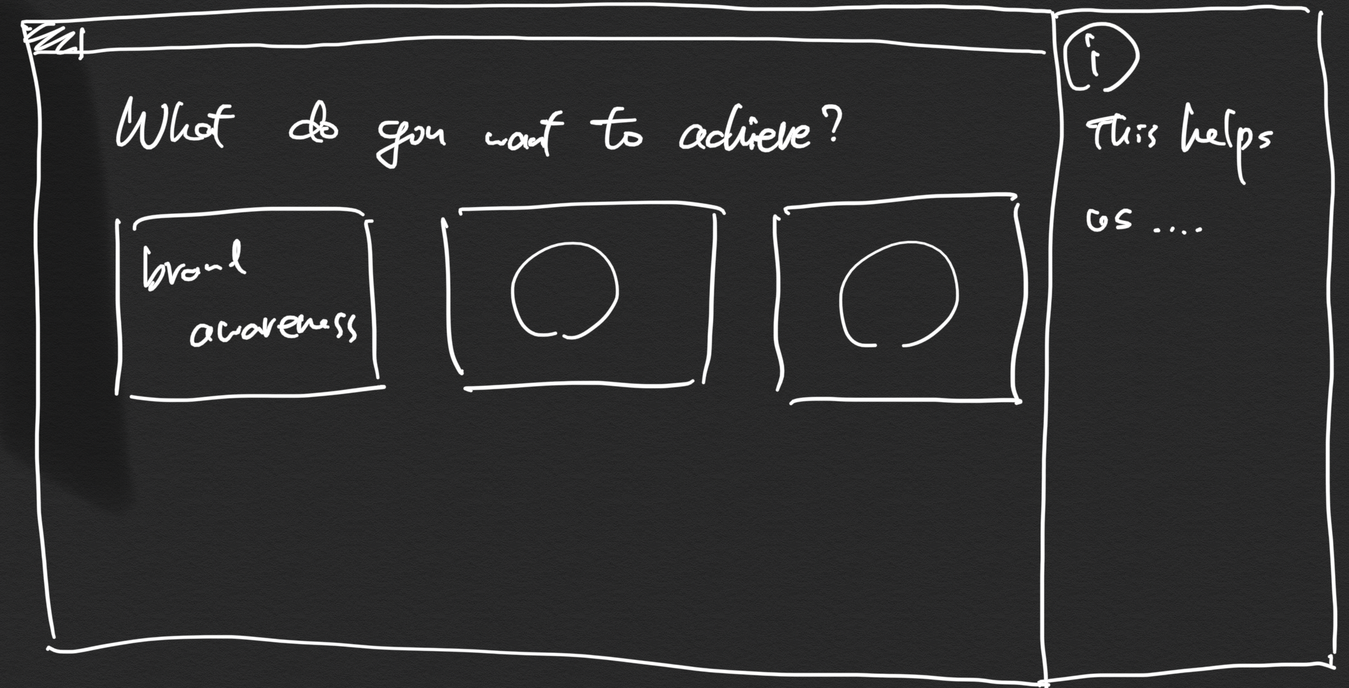
I also showcased referenced design direction, and drew a low-fidelity wireframe to communicate the direction we could explore.
I held two workshops to align on the scope and the objectives with the key stakeholders, and to brainstorm on the ideal collaboration workflow flowchart by assigning each participant a different hat based on our client personas, such as growth, SMB, and enterprise. I gave everyone ~45 minutes to draw out their ideal collaboration
workflow flowchart.
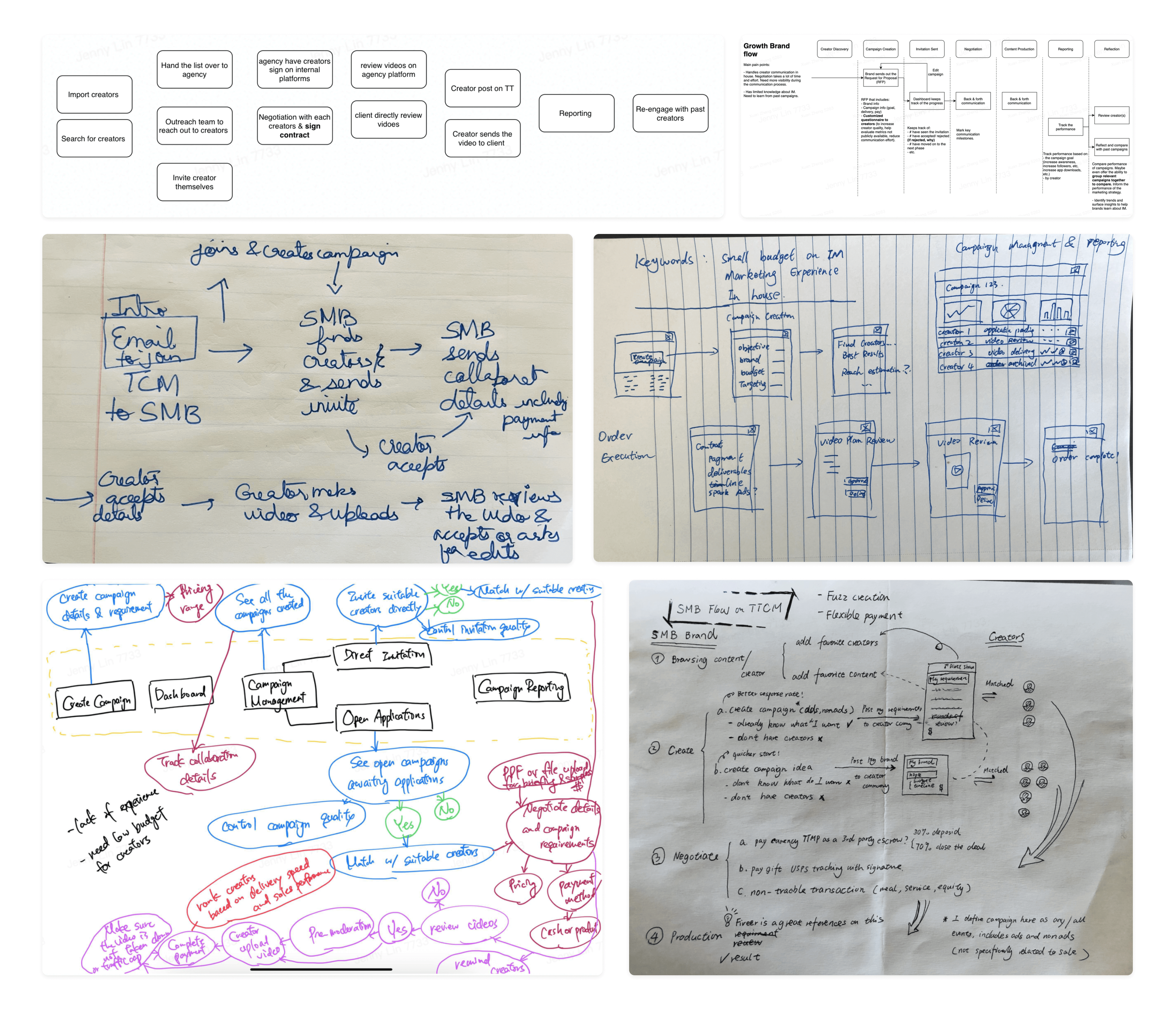
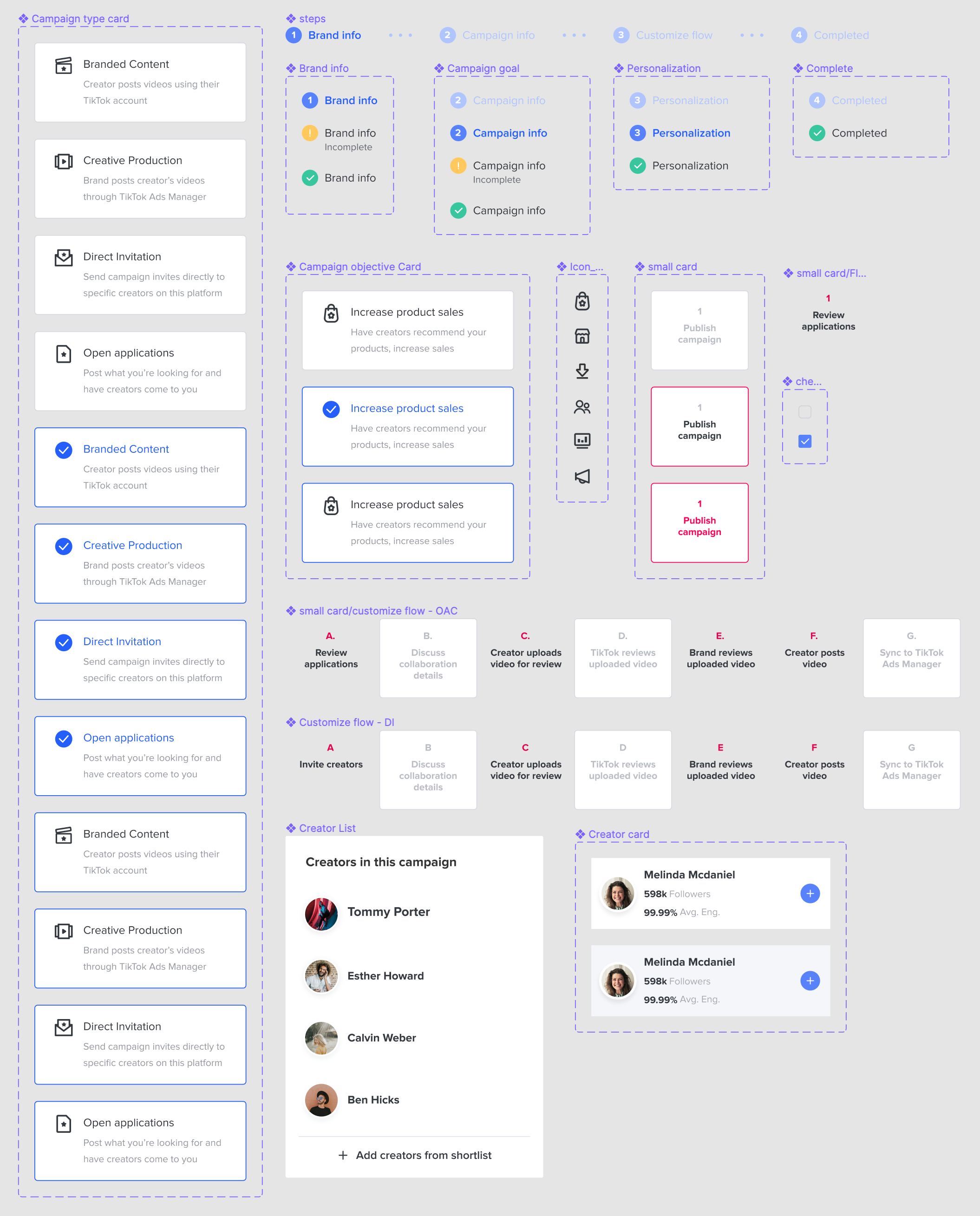
I then compiled and extracted everyone's ideal collaboration workflow flowchart into a comprehensive one shown below. I connected each phase of our user flow with the input fields grouping organized based on our data model.
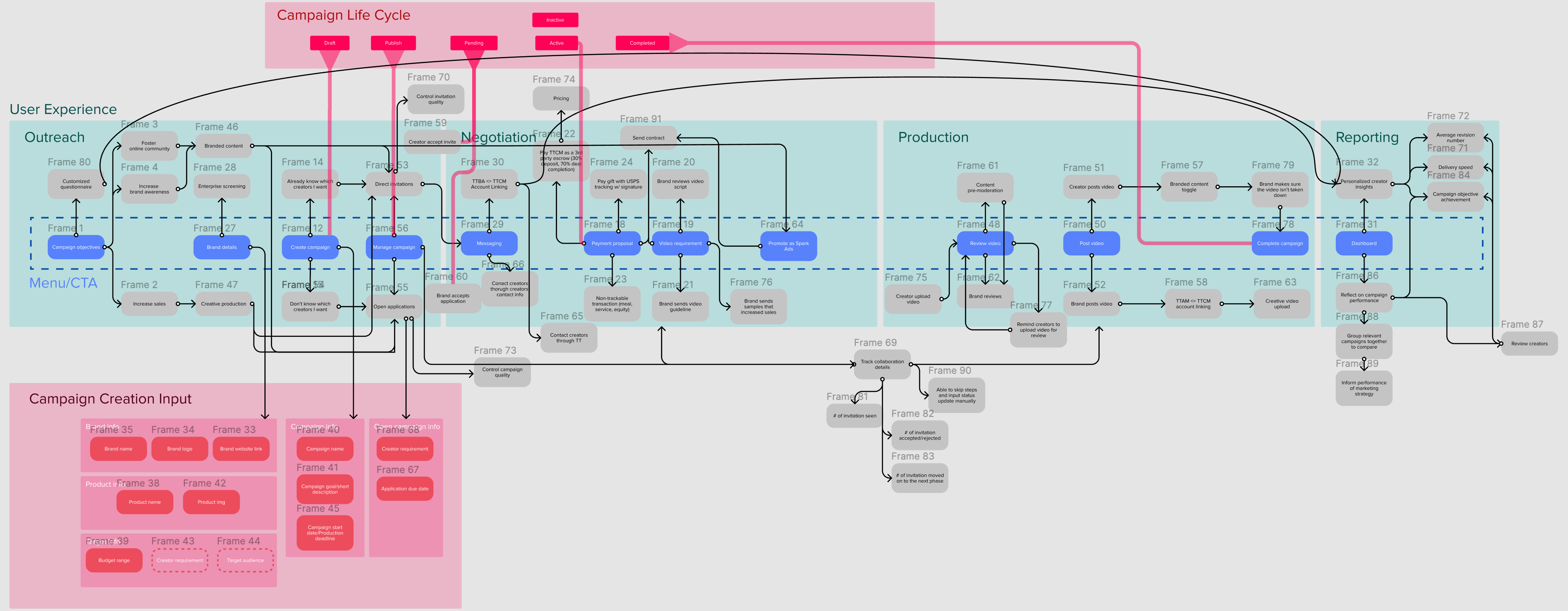
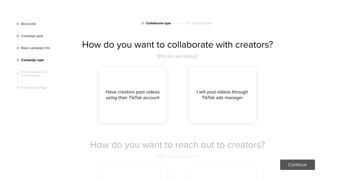
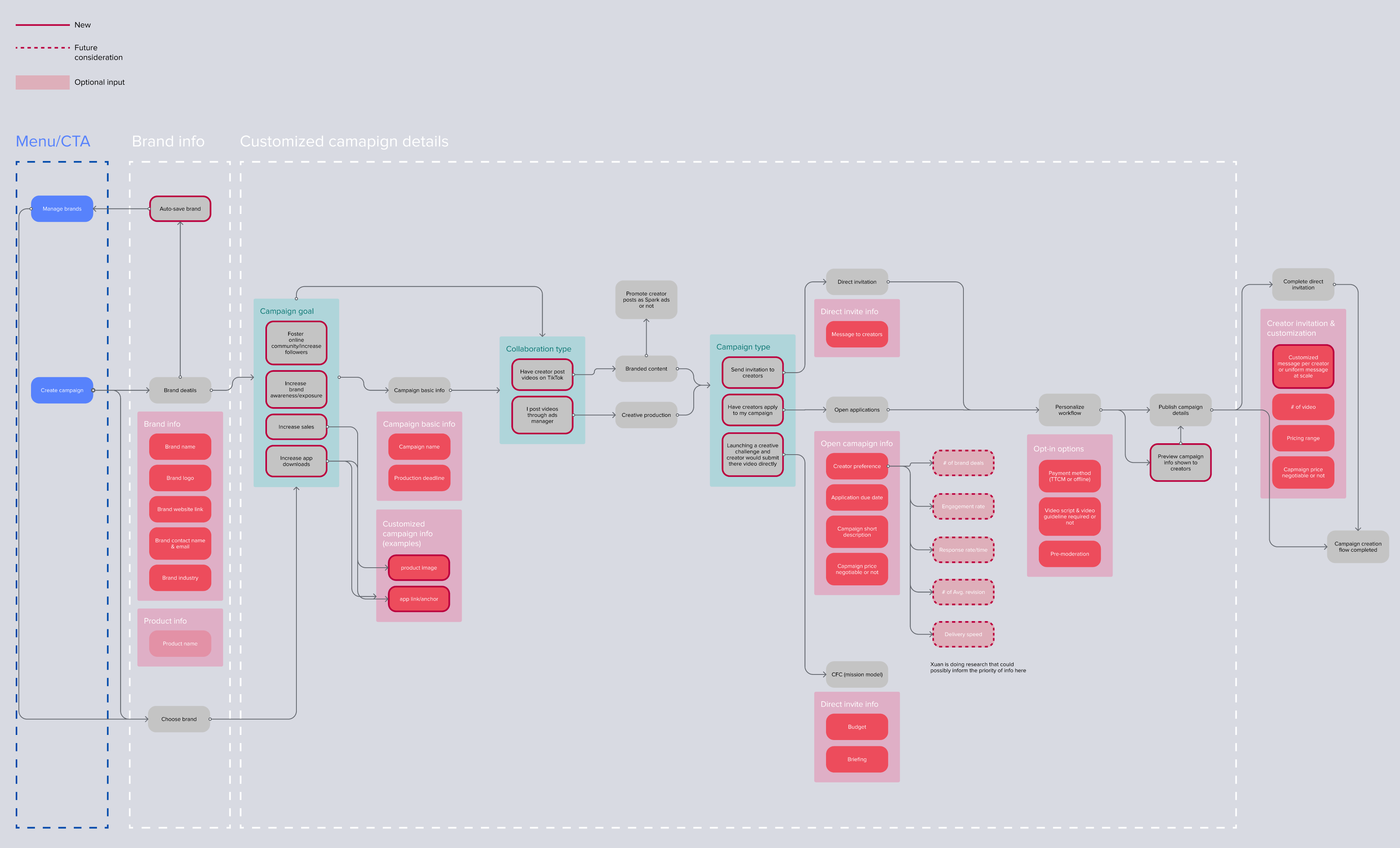
I discussed with our PMs to prioritize the features we wanted to include in our version 1 experiment and flesh out our product strategy. I then simplified the flowchart down to the campaign creation flow. I also cleared and reorganized the flowchart into an easier to understand one shown below and shared it with the broader team for alignment and feedback.
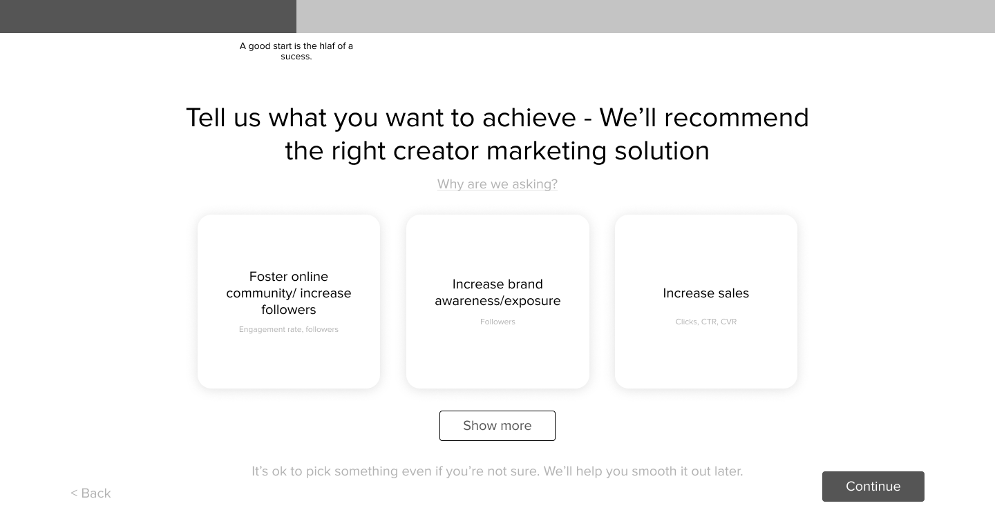
Once I finalized the flowchart, I started creating mid-fidelity designs and iterated multiple times over the span of a week based on the feedback I received from the PMs, engineers, UX writer, and UX researcher while building a working prototype for user testing. One of the biggest challenges was to balance our interface to cater to both beginner and experienced users. The initial version I had created catered only to the beginner users, as it was a lot more guided with only one task on a page. Over the iterations I had cut down the steps/pages tremendously and included more questions we needed input for from our clients into a single page to increase efficiency.

The UX researcher and I used the mid-fidelity design prototype (above) to interview 9 different participants ranging from SMB, growth, enterprise, and agency. It was an hour session with each to gain insights on the new campaign creation flow design, the new features design for the next version, and the existing campaign creation flow. The most important insight we got was that our inexperienced clients preferred the proposed modularized campaign creation flow design as it was more intuitive, less overwhelming, and visually more appealing. While the experienced clients, such as agencies, preferred the existing campaign creation flow because of its efficiency where they could input all the fields on one page and publish the campaign.
After a week of user testing conducted mainly by our UX researcher, I spent 1.5 weeks to finalize the direction for the new campaign creation flow design. I built the high-fidelity mockup in 3 days, and gained approval and recognition from the leadership during my presentation on the new campaign creation design.
The 4 key design principles for this new flow:
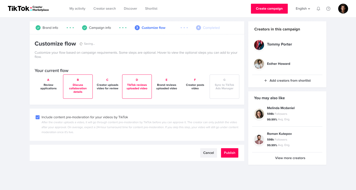
This reduces the cognitive load users have when using the current campaign creation form. One of the most significant differences in the new design is including a progress bar with all the information grouped into just 4 steps. The content of the next step would have 20% opacity and move to 100% opacity once scrolled past about 340px of the screen. The content of the next step would then be brought to the top of the screen with the progress bar indicating the client is on the next step. If the previous step did not have all the required fields filled then the icon of that particular step would turn yellow indicating that information is missing. (shown below)
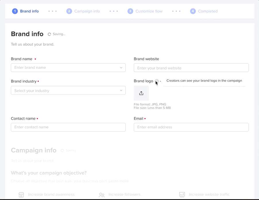
Once all the required fields are filled out by the client the icon would be replaced with a green check mark. Only after all the steps are marked green can the client publish the campaign. If not, a button will prompt the client to go back to the unfinished field.
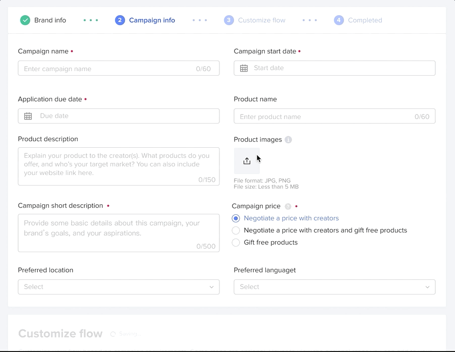
We want to give clients the freedom to hop around without the need to fill out all the required information to see the next steps. The new design allows clients to complete the required information in a non-linear way.
In our current campaign creation form, our clients have to input all the required fields to be able to save a draft, which defeats the purpose of having a saved draft since they might as well just publish the campaign. Hence, we want to make the draft saving process as seamless and easy as possible; especially since the campaign completion rate from draft is three times as high as that from scratch.
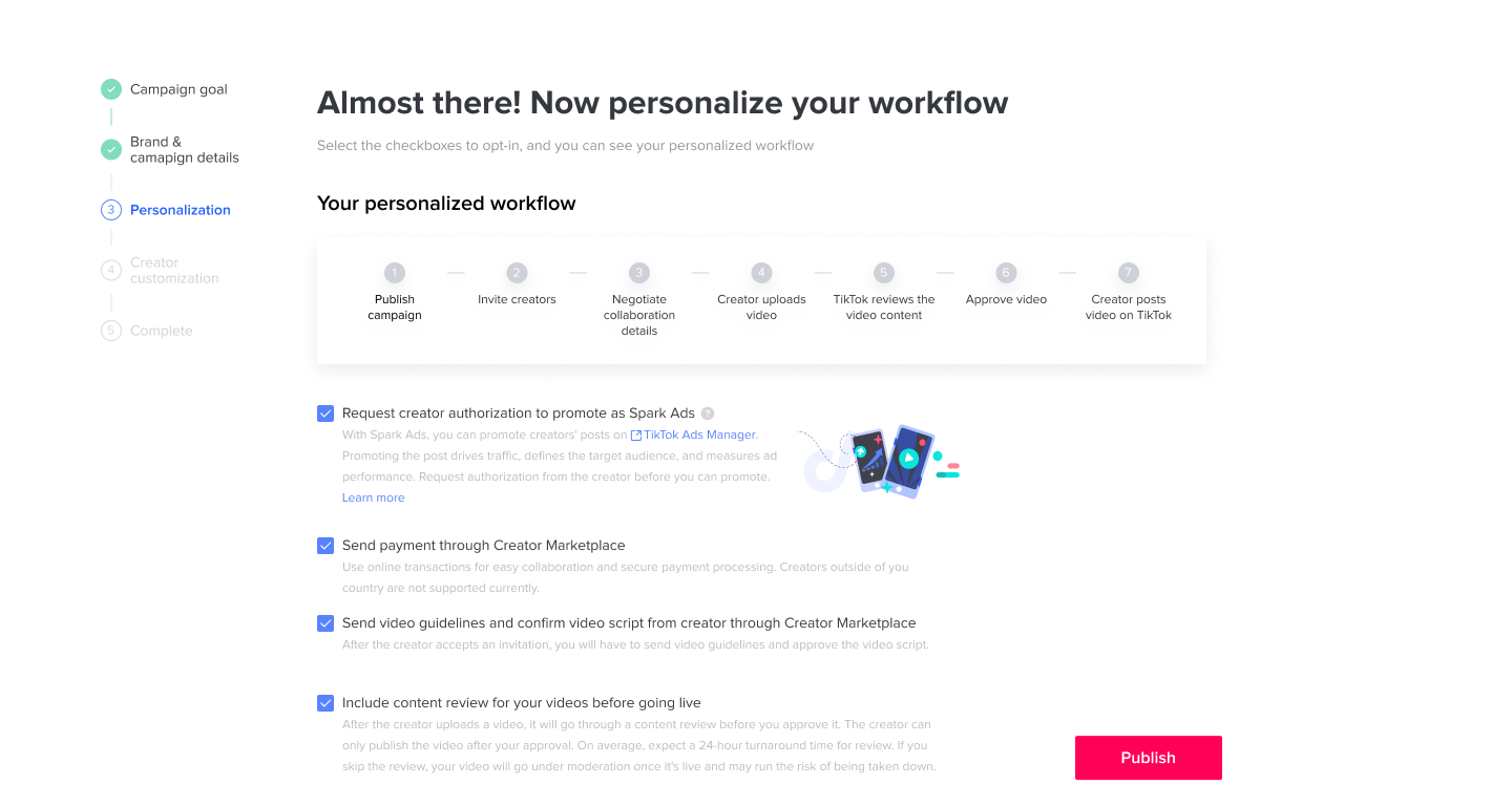
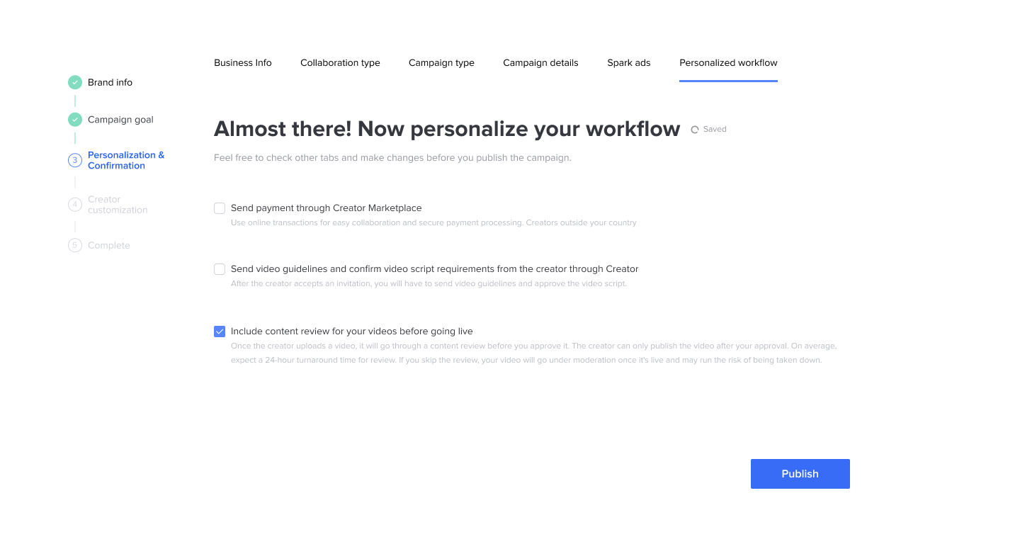
Another critical improvement is to make our customization section much more intuitive than just stacking all the checkboxes of different steps together. During our user testing, we found our participants spend a lot of time reading the customization section to figure out what each checkbox means even though there is a dynamic flow section above the checkbox to showcase what changes in the flow on checking a checkbox. (shown below)
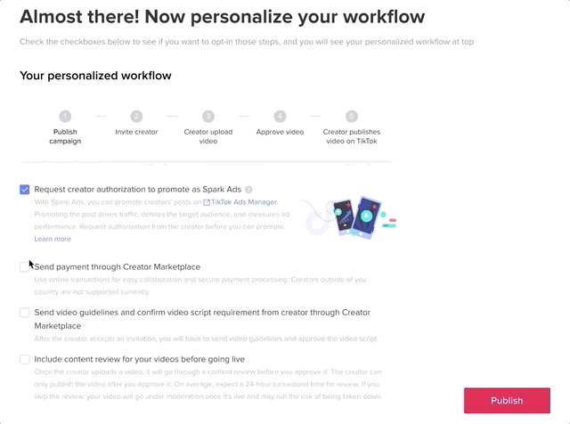
In order to solve this problem, I made all the steps of the flow visible including the optional steps that correspond to the clickable checkboxes and the required steps that are not clickable. I then have the corresponding checkboxes appear after the user hovers over the clickable step. This way, users can understand intuitively and instantly what the checkboxes mean and how checking the checkboxes would affect the flow. (shown below)

This was a challenging 0 to 1 initiative as it not only required complete rearrangement and innovation of the information hierarchy design, navigation revamp, modularization, but also included and affected many features that other PMs and designers were working on. I made sure to have consistent communications with the other designers working on other features to align and make sure the new design works for their features as well. I also kept my design aligned with the existing design system as much as possible, while challenging the design system and innovating to accommodate this project since our design system can be imperfect. The design was approved without any major pushbacks. We will add the new UI and visuals to our design system. I also created a component library for all the UI I created during this project.
Last but not least, this was a very content heavy project, as our wording would directly impact how guided and clear our campaign creation flow is. I hence involved our UX writer early on during the workshop stage, so that she stayed informed throughout the process. We disagreed regarding the tone of the product's voice, but eventually we were able to find the balance of not burdening our users with too much cognitive load and also keeping our tone more personalized. This project is launched globally on March 8th, 2022.