Goal × Context
Translation on a transparent display the size of a postage stamp.
Visual Translation was one of the rock multimodal AI experiences for the new form factor, display AI glasses that Meta had been brewing for years. It aimed to add value proposition to the new consumer wearable and find its product market fit by allowing users to take actions on what they see, translating on the go, all without the need to reach for their phone, hence staying connected with the world and the people around them.
I categorized translation scenarios around 2 use cases:
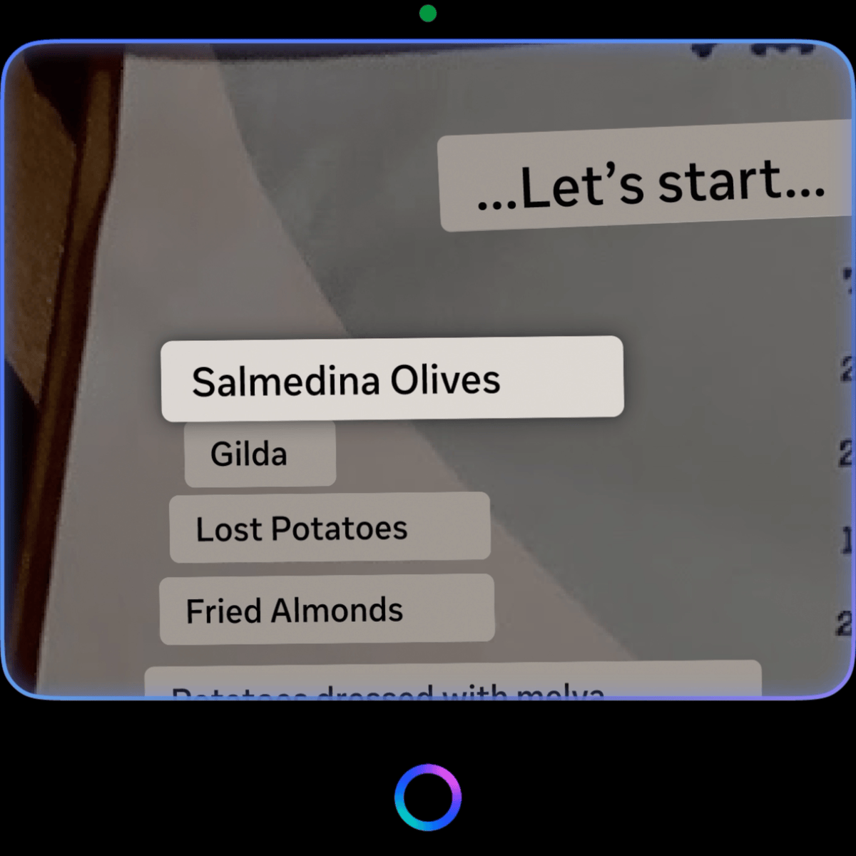
- Short-form texts — menus, street signs. Fast, glanceable.
- Long-form texts — posters, paragraphs. More text than fits in one glance.
As sole designer, I owned the interaction model, on-display rendering & navigation, gesture vocabulary, and the design POV for silent trigger for multimodal AI experiences. I partnered with the Interaction Model and User Education teams to shape and define the platform-wide gesture patterns and contextual gesture tutorials.
Pain Points × Problem Statement
"It's like dancing on a small table."
Visual Translation is one of those experiences that had to be iterated heavily based on the feedback from how users interact with it. In the initial stages, we learned the following challenges from user research studies and internal employee testings (dogfooding):
- Discovery — Users didn't know they could zoom or pan on our small 600 x 600px display. They'd miss half a translated menu and walk away thinking the feature was broken.
- Gesture friction — Captouch (on the temple of the glasses) swipes were easily mistaken for taps when users wiped up or down to zoom. Head IMU (Inertial Measurement Unit) panning was jittery and too sensitive — a small head movement sent the view flying, not to mention if user is on the move or in transit as the new form factor device is designed for on the go scenarios.
- Legibility — The small screen made reading real-world text and its translation difficult.
Each problem on its own felt like a fix. Together, they were a trust problem. If the user can't discover, can't navigate, and can't read the translation, the AI feels broken regardless of whether the model is right.
Design Principles x problem spaces
Intuitive, Easy, Quick.
I anchored the work on 3 principles to guide the redesign directions:
- Intuitive — the whole end-to-end interaction should feel natural and instinctive without the need for excessive explanation.
- Easy — the gesture vocabulary should reward small, natural movements, not demand precise manipulation.
- Quick — every step from invocation to translation consumption should compound toward speed.
These principles funneled into a clean framing:
"Optimizing for legibility of short texts and understanding of long texts."
2 scenarios, 2 different priorities, 1 consistent interaction language.
From there, I broke down the experience into 3 questions that guided the focus of design decisions:
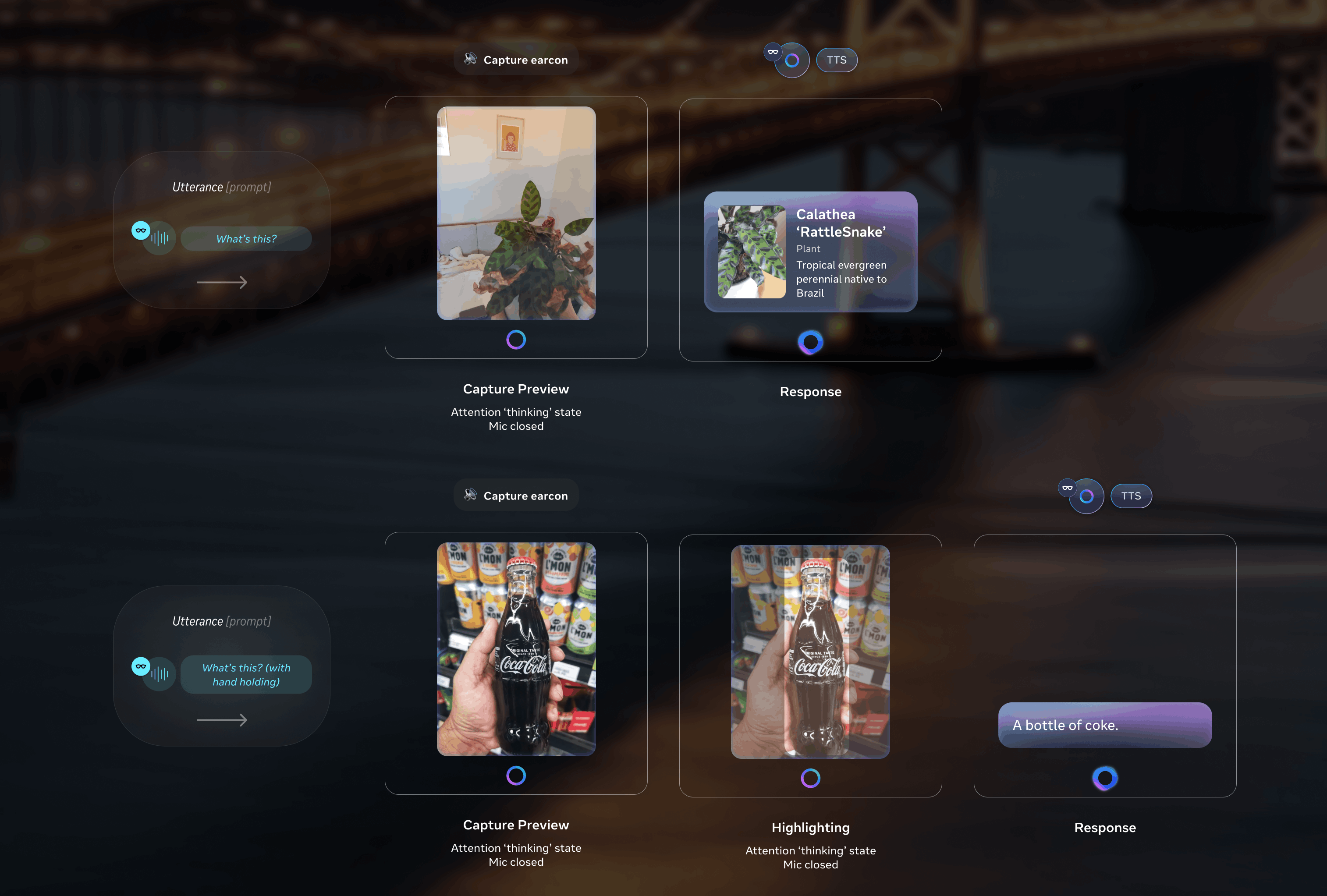
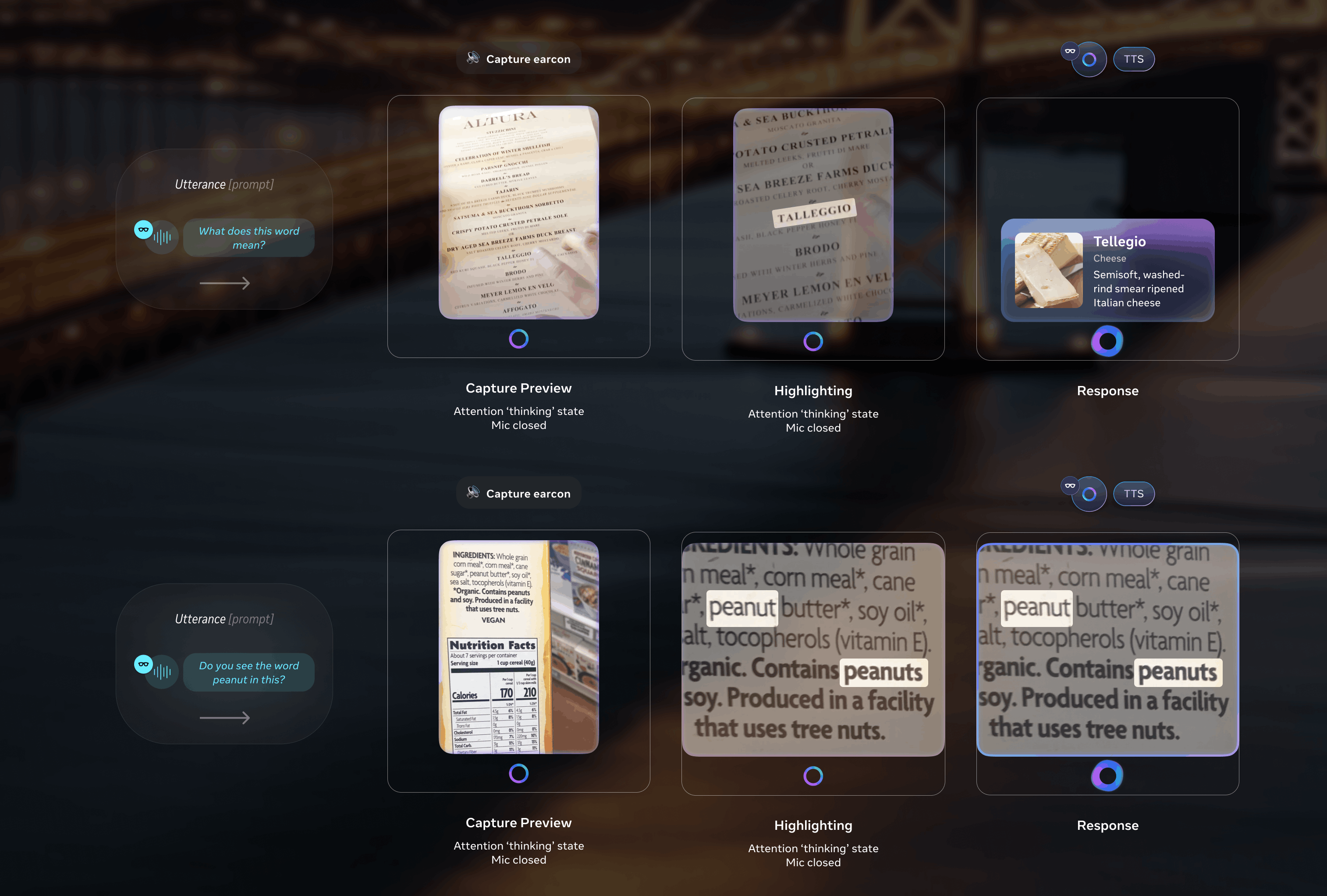
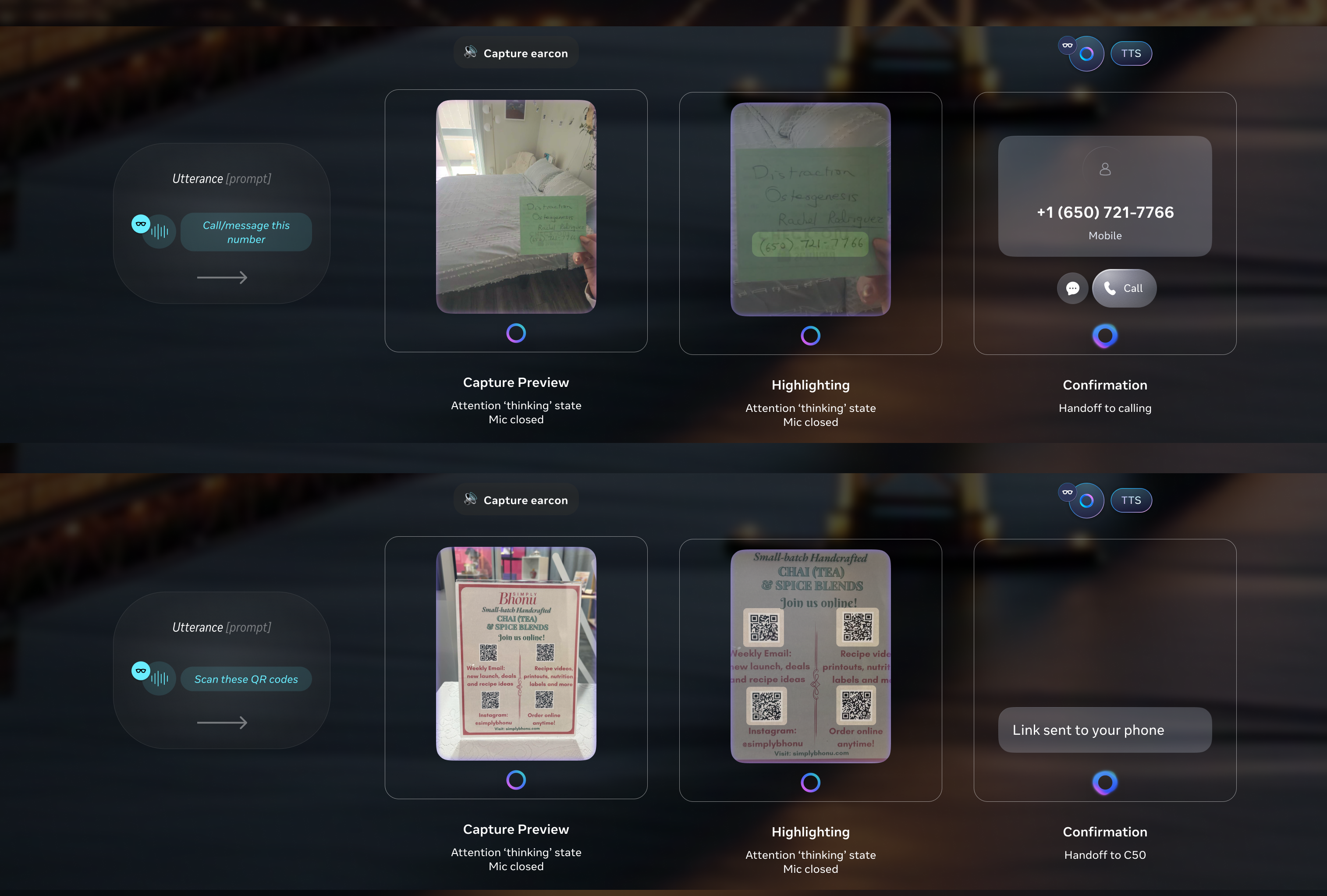
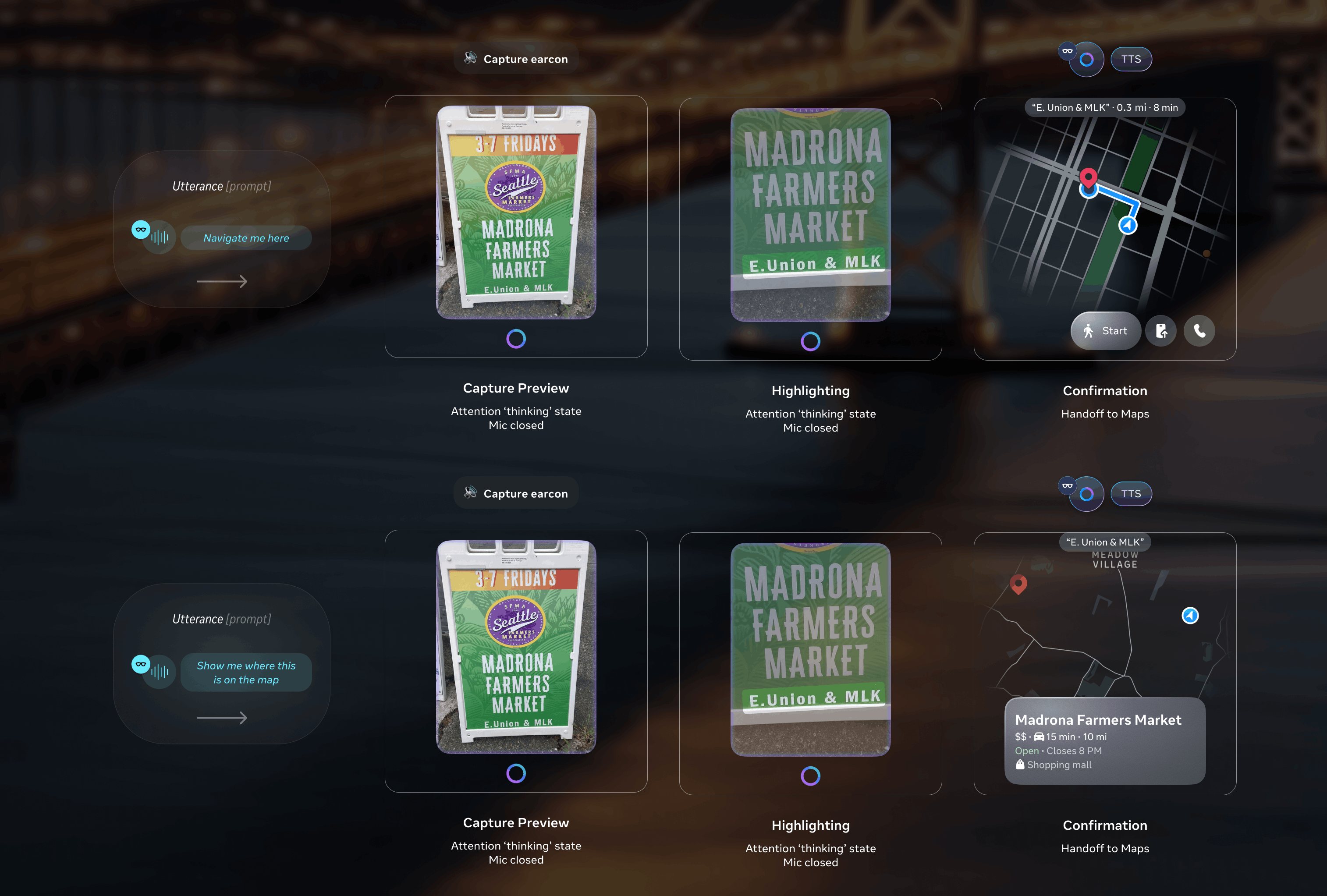
- Translation result format — How might we show the translated result in AI's audio response and on the display? What's the relationship between the two?
- Navigation — How might we enable user to move through the translated content especially without a direct manipulation surface like a touch screen?
- Follow-up actions — What can the user do after the translation lands?
Day 0 X Interaction Model 0 -> 1 solution
The devil is in the details.
The biggest design decision was the gesture vocabulary. The existing model — Captouch zoom + Head IMU pan — was producing too much friction for the user and too much instability for the visual experience. I proposed a new sets of interaction model that work together and complement each other, innovating on how users move through and consume real-world text and its translation without direct-manipulation touch screen while ensuring legibility:
- Smart text selection: focus-based pan + auto-zoom snap
On invocation, the system intelligently auto-zooms to the largest font in view, assuming it is the title — short-form texts get framed for a single glance, long-form texts get framed for reading flow. Given the opacity and color contrast constraints of the display, auto-zoom also magnifies the focused text box, ensuring clarity. The scaling is precisely calculated based on the text block and font size, guaranteeing optimal readability.
User then can consume the translation on the in-lens display by D-pad swiping where we smart pan and auto zoom to the next texts with minimum movement of the image so that user doesn't get overwhelmed by the continuous movement of the view. Our system identifies orientation, proximity, and reading order (shoutout to Jiaqian on all the detailed calculations to make this possible), allowing seamless navigation through varied real-world text arrangements. - Pan: EMG pinch hold + move
If the user wants to navigate to other parts of the translated document/image, they can pinch and drag to the exact spot quickly and freely. - Zoom: wrist roll
A small, intentional rotation of the wrist with the Neural Band, scales the translated image up or down. The gesture is small enough to do without arm fatigue and precise enough to land at a legible zoom level on the first try.
(optimized for long-form text consumption)
Reducing manual manipulation and increasing automation through the smart text selection was the answer, both visually for the user and technically for the system. Well for the most part, that's why we still enable free panning and zooming because nothing worse than user feeling stuck in the experience.
(optimized for short-form text consumption)
There were a lot of detailed considerations and guidelines needed in place for engineering to implement a seamless smart panning + auto-zoom snapping experience, from defining the max zoom level to requesting suitable image resolution. Some of these tradeoffs were real, including the tension between legibility and latency, and how we could mask the latency with transition animation. There were also significant iteration and calculation that went into having the system understand the orientation and reading order like a human, so that when user swipes, the next selection aligns with what user intends and expects. We also drilled into the time threshold for the system to know if you intend on landing on a specific word, so the auto zoom animation is smooth and blends well with selection.
how the system can intelligently process various real-world text layouts like a human
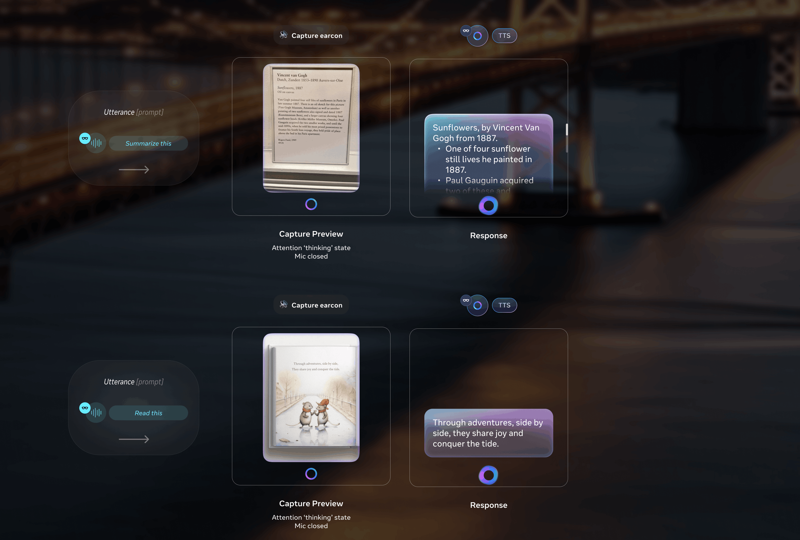
However, the text blocks are constained by the OCR (optical character recognition) grouping, plus the 600x600px display constraint, it is obviously not conducive for long-form text consumption, so I designed a solution for users to read paragraphs on the in-lens display if necessary.
- Reader mode (or formatted text) for long-form translated text
When user zooms into a long-form translation, such as paragraphs on a poster, the rendering shifts into standard formatted system text template optimized for legibility on the 600 x 600px display in terms of sizing and scrolling, reducing UXR feedback on legibility at launch. User can also manually switch to Reader mode through follow-up actions.
I redesigned this whole launch experience based on executive, UXR, internal employee testing and design system feedback, refining and optimizing the interaction logic in lock-step with Jiaqian.
This proposal didn't just live inside Visual Translation. Working with the Interaction Model team — in collaboration with Alex Gerrese — I shaped the broader proposal to unify wrist-roll zoom and pan gestures across other features, such as Map and Gallery. The interaction language I designed for translation became platform language.
Visual Translation along with all other multimodal AI features I standardized the interaction model pattern across were all launched with the announcement of Meta Ray-Ban Display with Neural Band at Meta Connect 2025 by Mark Zuckerberg.
Jiaqian and I also filed the patent for real-world text consumption interaction model on Augmented Reality device on the same day!
for the multimodal AI features I led.

Day 90 X Post-Launch Refinement
Too much user education is intrusive, too little leaves users stranded.
After Visual Translation is shipped alongside all the other multimodal AI experiences I designed for Meta Ray-Ban Display, the first round of post-launch user research and dogfooding surfaced 3 issues:
- Gesture difficulty
Even with the new interaction model — designed to be more intuitive than the original Captouch and Head IMU pairing — users were having trouble with free panning, zooming, and swipe-to-select. The gestures were new enough that discovery and confidence weren't where they needed to be. - Accidental exits
The "back" gesture exited the feature when users meant to navigate within it, losing the translation mid-experience. - Gesture conflict
Volume and zoom were both mapped to the same wrist-roll gesture, making the result after a wrist-roll unpredictable.
I designed two solutions, in partnership with the Interaction model and User Education team:
- Contextual EDU
I designed for the gesture education to surface at the "right" moments when users seem to intend to achieve a certain goal on the first try, following the contextual education playbook. Anchoring to the playbook kept the behavior consistent across features. - Revised zoom mode spec
Together with the Interaction model team, I shaped a system-level zoom mode that resolved the volume & zoom conflict, giving the gesture vocabulary cleaner boundaries. The fix extended beyond Visual Translation, so other features couldn't collide with the same input either.
The Day-90 release closed loops that Day-0 had left open. It also gave me a sharper picture of the gesture-discoverability problem on glasses generally — a problem I'd seen coming at the launch but hadn't fully solved.
Impact × Recognition
First display AI glasses +
a patent +
TIME Best Inventions 2025
+ UX Design Awards 2026.
Shipped on Meta's first AI glasses with high-resolution full-color in-lens display with whole new interaction model on the Neural Band, including the Day-0 multimodal AI launch and the Day-90 refinement release.
Patent filed for the interaction model for real-world text consumption on Augmented Reality (AR) devices by Meta Connect 2025, with myself recognized as the first inventor — my first patent.
Meta Ray-Ban Display glasses and Neural Band named to TIME's Best Inventions of 2025 and won UX Design Award 2026.
Visual Translation launched at Meta Connect 2025; other multimodal AI features I shipped on glasses were featured in both 2024 & 2025 Mark Zuckerbuerg's keynotes — covered by The Verge, The Verge hands-on, UploadVR, CNET, and The Verge accessibility column.
Reflection × What I'd Do Differently
About designing for hardware capability & AI behavior.
I would build a tighter feedback loop with the ML model, OCR, and Camera teams. Some of my design decisions were band-aids for upstream model behavior, OCR, and camera limitation. Earlier design–ML collaboration would have let me shape and influence the model's UX-relevant behavior directly, instead of designing around it downstream or heavily relying on my engineers to communicate with them.